Contributions:
Creative director
Graphic designer
Mattiveri is a brand born to challenge conventions, built around irony and the celebration of diversity. Its tone is direct, sharp, and deeply human. From the name itself to the smallest visual detail, Mattiveri is an invitation not to take ourselves too seriously—and to recognize that, deep down, we’re all a little mad. The brand’s visual identity was developed to reflect this spirit. At the heart of the system is a hand-drawn style typeface, where each character stays consistent with the overall look but remains unique and variable. The font visually translates one of the brand’s core values: diversity.
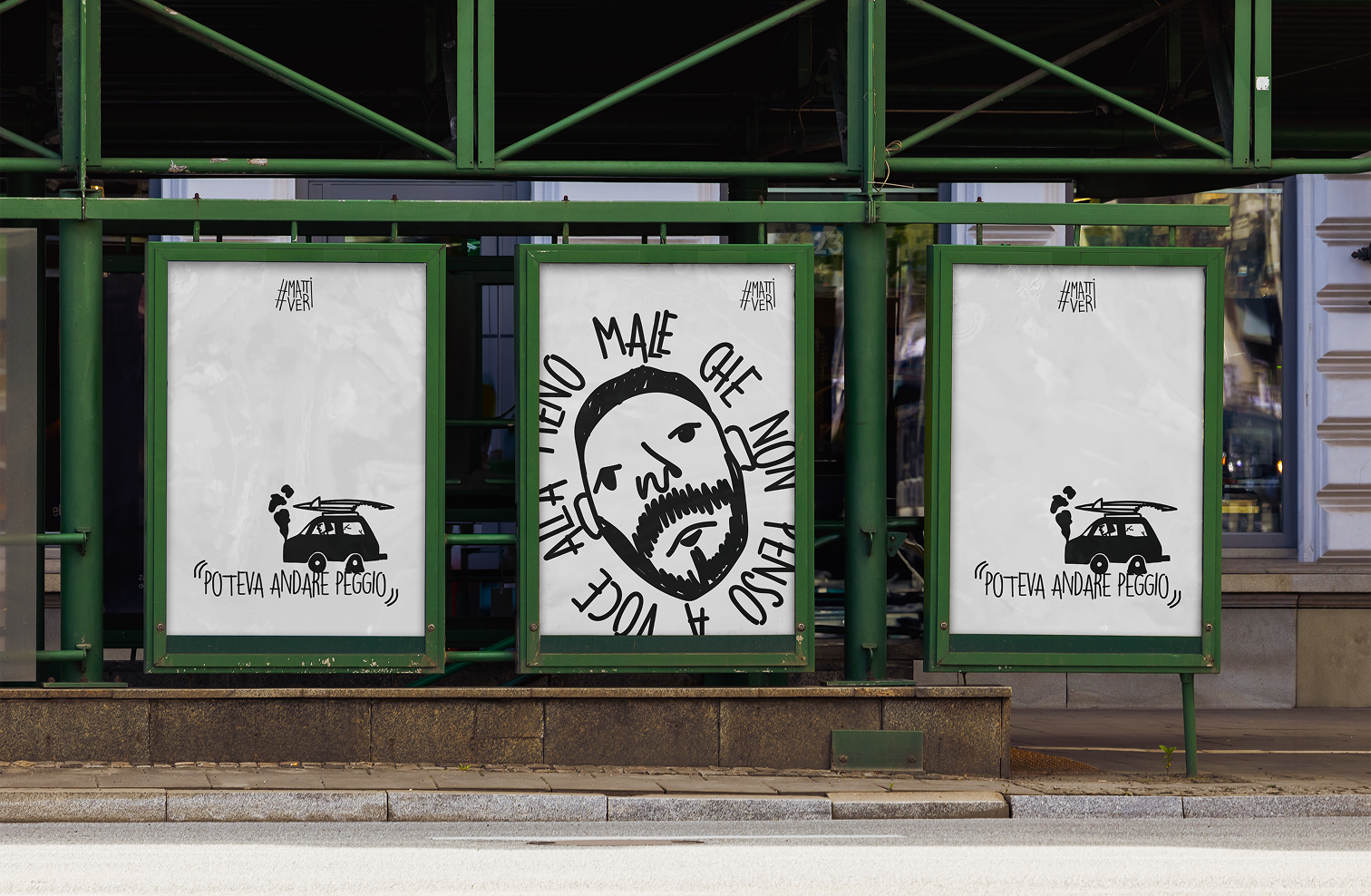
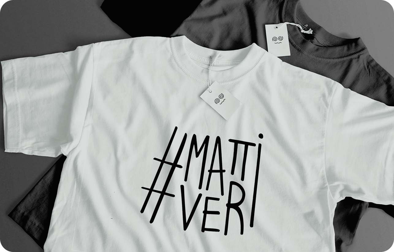
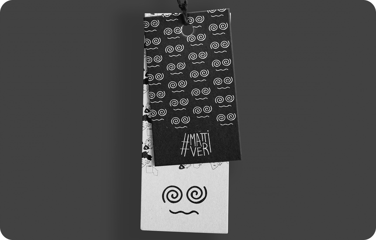
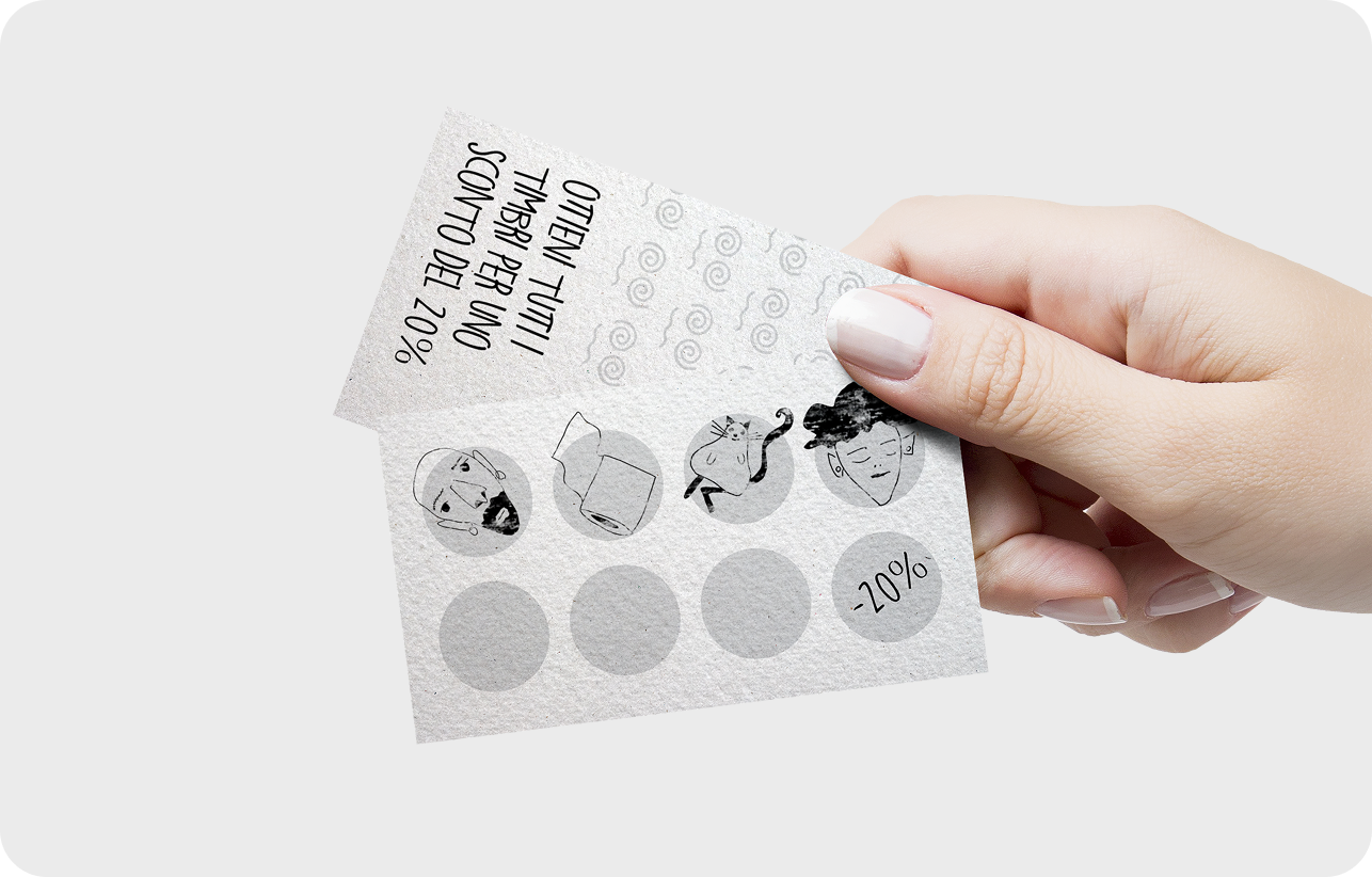
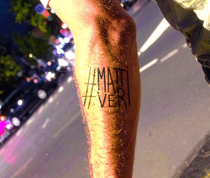
The logo is the hashtag #mattiveri, an immediate and recognizable symbol designed to thrive in a highly connected and shared culture. Completing the visual system is a series of custom illustrations that depict diverse individuals anyone can relate to. Beyond their narrative role, these illustrations also serve as interactive tools: they can be used as avatars or turned into stickers on request. The project also included the development of a poster strategy, with bold, visual messages designed to live in public spaces. Another way to bring Mattiveri’s identity into the real world—while staying true to its essence, character, and a touch of healthy madness.
The problem:
The challenge:
Celebrate uniqueness :
Every element of the brand reflects diversity. No strict rules—just bold personalities and visual identities that embrace differences.
Design with attitude :
A bold, sarcastic, unmistakable style. Mattiveri speaks with character—no compromises, no half-measures.
Make it personal :
From fonts to illustrations, every detail is crafted to spark personal connections and a true sense of belonging.
Exploration:

The logo
The logo is the union of the two words that make up the company name, stacked one above the other, connected both by the consistent line spacing created by the varying character heights and by the "I", which is shared between matti and veri.
The typeface:
The typeface was developed by hand, balancing consistency with variation. Each character is unique, reflecting Mattiveri’s core belief: we’re all different, and that’s exactly the point. It was then adapted and refined for digital use, resulting in a four-weight typeface that maintains its personality across every context.

The illustrations:
The illustration system is built from interchangeable features, allowing endless combinations to create diverse, personalized characters.